Moving my site from Jekyll to Eleventy - Part II.
What I learned along the way..
This is in continuation of my older post.
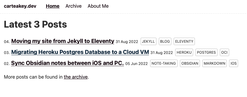
The site has come a long way from back when I posted the original article (This is what it looked like).
Here’s what I’ve been able to add so far.
Tailwind CSS
I wanted to build my own minimal design system, so Tailwind seemed perfect for it. It abstracts CSS by providing much easier-to-understand utility classes. Yes, the class names become huge, but the tradeoff of readability for building fast is very much worth it. I know there's no end to this discussion, but using Tailwind has been the easiest front-end building experience, in my limited time building frontends.
Install TailwindCSS.
npm install -D tailwindcss
npx tailwindcss init
Add your templates to tailwind.config.js
module.exports = {
content: ["./src/**/*.{njk,md}"],
Modify package.json build scripts to build the CSS. Here I use the npm-run-all package.
{
  "name": "carteakey.dev",
  "version": "0.0.1",
  "description": "",
  "scripts": {
    "build": "npm-run-all -s build:*",
    "build:11ty": "npx @11ty/eleventy",
    "build:css": "tailwindcss -i ./src/static/css/tailwind.css -o ./_site/css/tailwind.css --minify --postcss",
    "bench": "DEBUG=Eleventy:Benchmark* npx @11ty/eleventy",
    "watch": "npx @11ty/eleventy --watch",
    "serve": "npx @11ty/eleventy --serve",
    "start": "npm-run-all -p start:*",
    "start:11ty": "npx @11ty/eleventy --serve",
    "start:css": "tailwindcss -i ./src/static/css/tailwind.css -o ./_site/css/tailwind.css --watch --postcss",
    "debug": "DEBUG=* npx @11ty/eleventy"
  }
Use the built stylesheet in the base template.
<link rel="stylesheet" href="/css/tailwind.css" />Dark Mode
Here's where my transition started to pay off. Adding dark mode with Tailwind was trivial.
Add a script in your base template's head to store the user preferences, as well as respect the operating system preference.
    <script>
      const isDarkMode = () =>
        localStorage.theme === "dark" ||
        (!("theme" in localStorage) &&
          window.matchMedia("(prefers-color-scheme: dark)").matches);
      if (isDarkMode()) {
        document.documentElement.classList.add("dark");
      } else {
        document.documentElement.classList.remove("dark");
      }
    </script>
Add a button (preferably in the navbar) to allow users to toggle between Dark Mode and Light Mode. I use a feather-icons symbol.
 <button
            id="toggleDarkMode">
            <svg xmlns="http://www.w3.org/2000/svg" width="24" height="24" viewBox="0 0 24 24" fill="none" stroke="currentColor" stroke-width="2" stroke-linecap="round" stroke-linejoin="round" class="feather feather-sun feather-x"><circle cx="12" cy="12" r="5"></circle><line x1="12" y1="1" x2="12" y2="3"></line><line x1="12" y1="21" x2="12" y2="23"></line><line x1="4.22" y1="4.22" x2="5.64" y2="5.64"></line><line x1="18.36" y1="18.36" x2="19.78" y2="19.78"></line><line x1="1" y1="12" x2="3" y2="12"></line><line x1="21" y1="12" x2="23" y2="12"></line><line x1="4.22" y1="19.78" x2="5.64" y2="18.36"></line><line x1="18.36" y1="5.64" x2="19.78" y2="4.22"></line></svg>
 </button>
Add another script in your body listen to this button press and toggle dark modes.
  <script>
            document
              .getElementById("toggleDarkMode")
              .addEventListener("click", function () {
                console.log("Button Click!");
                if (isDarkMode()) {
                  localStorage.theme = "light";
                  document.documentElement.classList.remove("dark");
                } else {
                  localStorage.theme = "dark";
                  document.documentElement.classList.add("dark");
                }
              });
          </script>
Configure tailwind.config.js to have dark mode based on class.
module.exports = {
  content: ["./src/**/*.{njk,md}"],
  darkMode: 'class'
}
Add dark mode class variants to your preference wherever applicable. (Tailwind will handle dark variants automatically as well)
<body class="bg-gray-50 dark:bg-gray-800">And that's it. Fully functional dark mode with just a few lines of code.
Tailwind Typography
I wanted my site to have proper readability. As before, Tailwind comes to the rescue with its typography plugin.
Install the plugin.
npm install -D @tailwindcss/typographyThen add the plugin to your tailwind.config.js file.
module.exports = {
  theme: {
    // ...
  },
  plugins: [
    require('@tailwindcss/typography'),
    // ...
  ],
}
Add prose classes to your base template's parent element.
<body class="bg-gray-50 dark:bg-gray-800">
<div class="prose"> <!--Add this div element-->
<!-- Rest of the content goes here -->
</div>
</body>
This was a real shocker, with a few lines of code, the site changed from a shady 90's HTML site to a clean and modern design.
Centered Content & Readable line length
This took me embarrassingly long to figure out, but the solution was a simple one. We use the max-w-prose utility class provided to limit the width of the container.
<body class="bg-gray-50 dark:bg-gray-800">
<div class="md:max-w-prose mx-auto"> <!--Add this div element-->
<div class="prose">
<!-- Rest of the content goes here -->
</div>
</div>
</body>
Comments with Utterances
I used Disqus on my old site, and it was time to move to an open-source and no lock-in alternative.
Utterances is great, it uses GitHub issues to store comments, that's genius!
Add the following script tag to your blog's template.
<script src="https://utteranc.es/client.js"
        repo="[ENTER REPO HERE]"
        issue-term="pathname"
        theme="github-light"
        crossorigin="anonymous"
        async>
</script>
I wanted it to dynamically sync the theme of the comments with the site's theme, which was a little more involved.
<div class="comments">
  <script>

      // load utteranc comment
      var getTheme = window.localStorage && window.localStorage.getItem("theme");
      getTheme = getTheme == null ? 'light' : getTheme;

      let theme = getTheme === 'dark' ? 'github-dark' : 'github-light';
      let s = document.createElement('script');
      s.src = 'https://utteranc.es/client.js';
      s.setAttribute('repo', 'carteakey/carteakey.dev');
      s.setAttribute('issue-term', 'pathname');
      s.setAttribute('theme', theme);
      s.setAttribute('crossorigin', 'anonymous');
      s.setAttribute('async', '');
      document.querySelector('div.comments').innerHTML = '';
      document.querySelector('div.comments').appendChild(s);

      // auto switch utteranc theme by body class change
      const mutationObserver = new MutationObserver((mutationsList, observer) => {
          mutationsList.forEach(mutation => {
              if (mutation.attributeName === "class") {
                  if (document.querySelector('.utterances-frame')) {
                      const theme = mutation.target.classList.contains("dark-theme") ? 'github-dark' : 'github-light'

                      const message = {
                          type: 'set-theme',
                          theme: theme
                      };
                      const iframe = document.querySelector('.utterances-frame');
                      iframe.contentWindow.postMessage(message, 'https://utteranc.es');
                  }
              }
          })
      });
      mutationObserver.observe(document.body, { attributes: true });
  </script>
</div>
Netlify CMS
Since I was already using Netlify as my hosting solution, it made sense to use the CMS as well, to make editing and publishing new posts easier. I could do it directly, but I always end up working on the site's code, instead of posting blogs, which is why the whole site exists, ugh...
The habit won't go away anytime soon, so a CMS helps separate code from the content and helps me focus on writing more.
PS - This is the first one being posted by the CMS and it's a better flow.
We just need to add 2 files inside the admin folder of our site.
admin/index.html - This will be the page where we manage our content.
<!doctype html>
<html>
<head>
  <meta charset="utf-8" />
  <meta name="viewport" content="width=device-width, initial-scale=1.0" />
  <title>Content Manager</title>
  <script src="https://identity.netlify.com/v1/netlify-identity-widget.js"></script>
</head>
<body>
  <!-- Include the script that builds the page and powers Netlify CMS -->
  <script src="https://unpkg.com/netlify-cms@^2.0.0/dist/netlify-cms.js"></script>

</body>
</html>
admin/config.yaml - This will be the CMS config and point to the various collections on our site. Here's a sample.
backend:
  name: git-gateway
  branch: main

# publish_mode: editorial_workflow
media_folder: "src/static/img" # Media files will be stored in the repo under src/static/img
public_folder: "/img"

collections:
  - label: "Blog"
    name: "blog"
    folder: "src/posts"
    create: true
    slug: "---" # Filename template, e.g., YYYY-MM-DD-title.md
    editor:
      preview: false
    fields:
      - { label: "Title", name: "title", widget: "string" }
      - { label: "Description", name: "description", widget: "string" }
      - { label: "Publish Date", name: "date", widget: "datetime" }
      - { label: "Body", name: "body", widget: "markdown" }
    - widget: list
        label: "tags"
        name: "tags"
        allow_add: true
        max: 4
        min: 1
Notices in Markdown
Github-flavored markdown offers an easy way to have tips/callouts in your article, to call attention to a block of text.
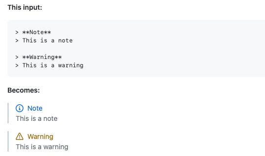
There's no such thing here, and I have to rely on blockquote + emoji, or single row table + emoji instead e.g.
- Blockquote + Emoji (I use the markdown-it-emoji plugin)
> :exclamation: This is important❗ This is important
- Single-row table + Emoji
| :exclamation: | This is very important  |
|---------------|:------------------------|| ❗ | This is very important |
|---|
I am still working on ironing many things out, like responsive images, and better-looking notices, but anyways, these are simple puzzles in my pursuit to make the site better.
I've had a lot of fun building the site, and with web dev becoming easier day by day, it was the perfect time to make the jump.
- Next: Repurposing my laptop as a Home Server.
- Previous: Building Mesa (with VA-API) from Source on Fedora.